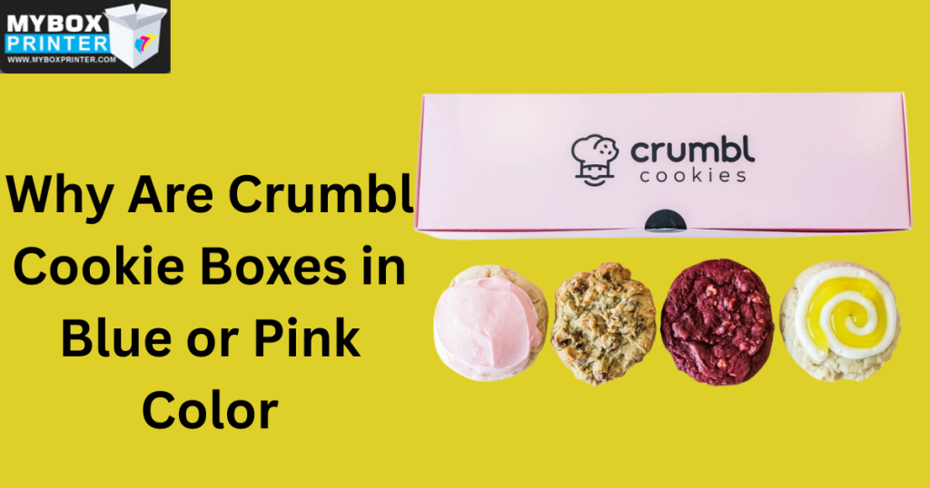
You already know the brand before you even see the logo if you’ve ever watched a long, rectangular silhouette emerging from a passenger seat or flashing under the ring light of a TikTok content creator. One of the most well-known items of packaging in the food industry today is the Crumbl Pink Box. However, the selection of those particular hues- and the sporadic hint of blue on Crumbl cookie boxes- is not merely chance. Nostalgia, color psychology, and a stroke of brilliance from a university marketing project combine strategically.
A Whiff Of Nostalgia From The Pink Cadillac Inspiration
A personal memory of co-founder Sawyer Hemsley is the main reason Crumbl is wrapped in its trademark pink. Hemsley’s neighbor had a vintage, spotless pink Cadillac as he was growing up. He saw everyone pause to gaze whenever the car went along the street. It made people feel good, most importantly; it was classy and daring.
Hemsley wanted that same show-stopper impact when Crumbl was launched. Most bakeries, he understood, used uninteresting hues- browns, white, or tans that disappeared against the background. Choosing a bright, vintage-inspired pink guaranteed that anyone passing along the street with a box of cookies was effectively carrying a mobile billboard that drew as much attention as that ancient Cadillac.
Psychology of Crumbl Pink and Navy Blue
Although the inspiration was reminiscent, the result is mental. Colors in branding of Crumbl cookie packaging reflect our subconscious. Designed to cause feelings of playfulness, warmth, and indulgence, the particular hue of Crumbl Pink (which is now an official Pantone color) is supposed to provoke this. It tells the brain that this is a reward. Crumbl’s pink, unlike a gentle pastel, is vivid and dynamic, which gives the brand a contemporary and hype-worthy vibe.
The Blue highlights- seen in the Baker Man in the logo and subordinate branding- have a different role. Blue is the color of professionalism, reliability, and trust. Crumbl fuses the fun of a cookie shop with the elegance of a luxury brand by using a vivid pink color along with a cool, dark navy blue. It tells the customer, We enjoy ourselves but take our baking seriously. This contrast is a traditional design strategy employed to give a brand both approachable and upscale appearance.
The Flower Box Design: Beyond Color
Discussing the form is absolutely necessary in talking about the hue. Hemsley and his classmates discovered during a marketing case competition at Utah State University that conventional square boxes caused large, gourmet cookies to glide and stack, thereby destroying the frosting. They came on the oblong, horizontal box expressly to arrange the cookies side-by-side like artwork.
Many times, the founders have compared the unboxing experience of Crumble cookie box to opening a box of long-stemmed roses. The pink box is as long as a florist’s delivery, making the buying of cookies a present-like experience. The pink packaging transforms the inside into a luxury gift and not just a snack, whether you are buying them for yourself or for a friend. One of the main reasons the brand has remained at a premium price point is its gift-like visual appeal.
Designed for the Social Media Age
The camera-ready factor is perhaps the most pragmatic justification for the pink and blue motif. Crumbl’s founders saw in its early days that word of mouth had migrated to Instagram and TikTok. They had to find a box that would contrast against every background.
A stopping color, the brilliant pink breaks a user’s scrolling. Its consistency across all of the stores lends it a visual mark. Your brain registers Crumbl before the speaker even begins their remarks as you watch that pink box in a video. This has let the company expand rapidly by means of user-generated content since customers believe the custom crumbl cookie boxes itself fit the look they want to share on their feeds.
Masterclass on Contemporary Brand
From a neighbor’s car to a Pantone-certified icon, the Crumbl colors show branding is about more than just looking attractive. It’s about establishing a physical presence that cannot be ignored and an emotional link. The pink evokes delight, the blue evokes trust, and the unusual form adds wow factor. Together, they make a humble cookie feel like an event.
Where to Order Cookie Boxes
MyBoxPrinter is a trustworthy and professional choice to think about if you want to buy pink or blue Crumbl-style cookie boxes. Custom printed packaging is MyBoxPrinter’s specialty; so, it is simple to design cookie boxes based on well-known color schemes such as pink and blue while still adjusting the design to meet your own brand or event requirements.
The degree of customization MyBoxPrinter provides is among the main benefits of ordering from them. You can select the precise hue of pink or blue you wish, modify box sizes to accommodate enormous cookies, and include personalized printing such as logos, company names, or special messages. This suits parties, presents, and unique events in addition to bakeries and home-based cookie companies.
High-quality, food-safe, and long-lasting materials used by MyBoxPrinter guarantee that cookies remain presentable and protected throughout shipping and handling. Especially when packing premium or large cookies like to Crumbl-style items, their boxes are made to strike a compromise between strength and an appealing finish.
Low minimum order quantities of bespoke pink or blue cookie boxes allow small enterprises and individual buyers to buy them without making significant bulk purchases, therefore providing yet another major advantage. Together with expert printing and design help, MyBoxPrinter enables the whole ordering procedure to be easy and reachable.
Should you desire cookie boxes with pink or blue visual appeal maintaining quality and originality, Crumbl-inspired packaging enables MyBoxPrinter to provide a flexible and reliable custom cookie box order solution.


